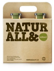
NATURALL & ZDRAVO
Redesign of 100% natural juices and other organic/bio products from the Serbian company ZdravoOrganic, which manufactures healthy organic food products, included creating the new label and the new shape of glass containers. The very name of the product, “ZDRAVO”, has
NATURALL & ZDRAVO
Redesign of 100% natural juices and other organic/bio products from the Serbian company ZdravoOrganic, which manufactures healthy organic food products, included creating the new label and the new shape of glass containers. The very name of the product, “ZDRAVO”, has

Biougalj ID
We create ID for Biougalj Company (Biougalj = Biochar or terra preta, is a name for charcoal when it is used for particular purposes). Nemanja Jehlicka we love you :)!
Biougalj ID
We create ID for Biougalj Company (Biougalj = Biochar or terra preta, is a name for charcoal when it is used for particular purposes). Nemanja Jehlicka we love you :)!
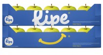
Ripe :) Fruit Farms ID
Peter Gregson Studio create name and ID for Ripe – Fruit Farms Serbia. Logo designed by: Nemanja Jehlicka.
Ripe :) Fruit Farms ID
Peter Gregson Studio create name and ID for Ripe – Fruit Farms Serbia. Logo designed by: Nemanja Jehlicka.

The Coca-Cola Head office Belgrade
We were engaged by Coca-Cola Co. Serbia to do the branding of their offices in Belgrade. Our task was summarized in the following: “100% same place, 100% same people, 100% new look”. In other words, we were in charge of
The Coca-Cola Head office Belgrade
We were engaged by Coca-Cola Co. Serbia to do the branding of their offices in Belgrade. Our task was summarized in the following: “100% same place, 100% same people, 100% new look”. In other words, we were in charge of
Faculty of Sciences, University of Novi Sad
Promotional material for the Faculty of Sciences, University of Novi Sad enrollment campaign. We photographed real life objects and used them to design the posters and other materials for each Department of the faculty (chemistry, physics, geography, biology, mathematics, etc.).

Panonit.net
We create ID and logo system for Internet provider Panonit.net.
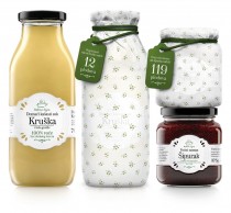
GRANNY’S SECRET
GRANNY’S SECRET is the best line of natural home style food products on Serbian market and PeterGregsonStudio task was to create a completely new glass packaging and labels for their products. Since all of our art directors had beautiful warm
GRANNY’S SECRET
GRANNY’S SECRET is the best line of natural home style food products on Serbian market and PeterGregsonStudio task was to create a completely new glass packaging and labels for their products. Since all of our art directors had beautiful warm
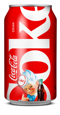
Coca-Cola 125th Anniversary Collectible Cans
Peter Gregson designed a series of 6 different Coca-Cola cans for the celebration of Coca-Cola 125th anniversary. We used old Coca-Cola ads and posters (from 1930′s, 1940′s) and implemented them in order to create the can that would remind of
Coca-Cola 125th Anniversary Collectible Cans
Peter Gregson designed a series of 6 different Coca-Cola cans for the celebration of Coca-Cola 125th anniversary. We used old Coca-Cola ads and posters (from 1930′s, 1940′s) and implemented them in order to create the can that would remind of
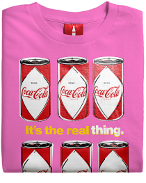
The Coca-Cola T-Shirt
PGS create pop-art illustration for The Coca-Cola 125th Anniversary gift sets.
The Coca-Cola T-Shirt
PGS create pop-art illustration for The Coca-Cola 125th Anniversary gift sets.

BEWARE!
BEWARE (ПАЗИ- in Serbia Cyrillic) is a series of 9 illustrated posters for the primary schools in Novi Sad. Posters are the part of campaign ”SAFE WORLD” of the Public Health Institute of Vojvodina (Serbia) that was aimed at raising
BEWARE!
BEWARE (ПАЗИ- in Serbia Cyrillic) is a series of 9 illustrated posters for the primary schools in Novi Sad. Posters are the part of campaign ”SAFE WORLD” of the Public Health Institute of Vojvodina (Serbia) that was aimed at raising