News
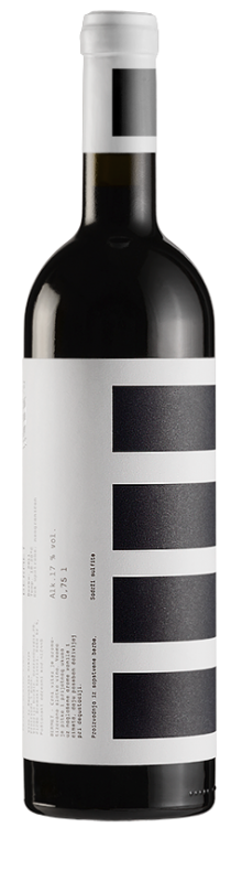
Djurdjic Winery
PGS develop complete identity & system for labels for winery Djurdjic from Sremski Karlovci – Serbia.
Djurdjic Winery
PGS develop complete identity & system for labels for winery Djurdjic from Sremski Karlovci – Serbia.

All the best!
We wish you all the best and happy new year! PGS
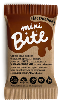
NEW Mini Bite!
Biofoodlab company launch two new tastes: Bite Coconut and Bite Chocolate + new mini Bite’s series. Dsgn by PGS.
NEW Mini Bite!
Biofoodlab company launch two new tastes: Bite Coconut and Bite Chocolate + new mini Bite’s series. Dsgn by PGS.
Suncokret become Granum®
One of the latest Peter Gregson tasks was to re-brand – transform “Suncokret” (Sunflower) into new brand name under 4 different groups – categories: Granum®Food (Seed butters, cold pressed oils), Granum®Drops (Natural oil extracts & supplements), Granum®Bar (Natural Snack bars)
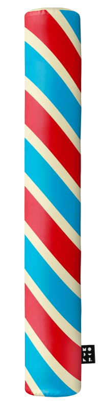
SOOO CANDY
New work from Peter Gregson Studio. Design for MODULI home accessories inspired by by JOY and traditional liquorice sweets and hard candies. Created to make our life environment sweeter! MODULI products are made of quality, resistant and washable materials which
SOOO CANDY
New work from Peter Gregson Studio. Design for MODULI home accessories inspired by by JOY and traditional liquorice sweets and hard candies. Created to make our life environment sweeter! MODULI products are made of quality, resistant and washable materials which
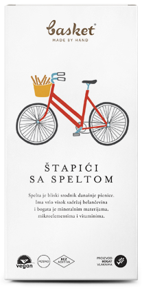
Basket Snacks Redesign
PGS new project task was to redesign packaging and identity for really delicious handmade snack Basket®. Illustration done by: Marijana Rot :)
Basket Snacks Redesign
PGS new project task was to redesign packaging and identity for really delicious handmade snack Basket®. Illustration done by: Marijana Rot :)

The Laser Summit of Cheap Graphics
The Laser Summit of Cheap Graphics brings together creative people from various branches of the industry: design, illustration and visual communications.
The Laser Summit of Cheap Graphics
The Laser Summit of Cheap Graphics brings together creative people from various branches of the industry: design, illustration and visual communications.

PGS in novum magazine 08.13
German magazine novum featured the work of Peter Gregson Studio.

Conference ID: Rebranding Serbia
Rebranding Serbia’s vision is to change the status of the branding of Serbia – from a passive, spectator phase and a “victim” into an active contributor and a creator of its own, positive image by bettering itself accompanied by long-term,
Conference ID: Rebranding Serbia
Rebranding Serbia’s vision is to change the status of the branding of Serbia – from a passive, spectator phase and a “victim” into an active contributor and a creator of its own, positive image by bettering itself accompanied by long-term,

Bite Space Box 2
In the meantime, we were working on developing aluminum gift box for for Bite.