Packaging Design
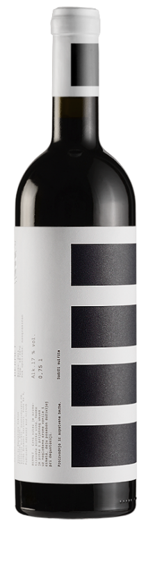
Djurdjic Winery
PGS develop complete identity & system for labels for winery Djurdjic from Sremski Karlovci – Serbia.
Djurdjic Winery
PGS develop complete identity & system for labels for winery Djurdjic from Sremski Karlovci – Serbia.
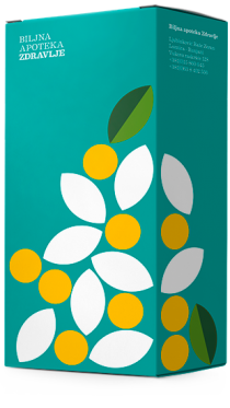
Herbal Pharmacy Box
Universal packaging in two sizes, designed by PGS for Herbal Pharmacy “ZDRAVLJE” (Health), which produces herbal medicines from herbs that are grown in environmentally clean conditions.
Herbal Pharmacy Box
Universal packaging in two sizes, designed by PGS for Herbal Pharmacy “ZDRAVLJE” (Health), which produces herbal medicines from herbs that are grown in environmentally clean conditions.
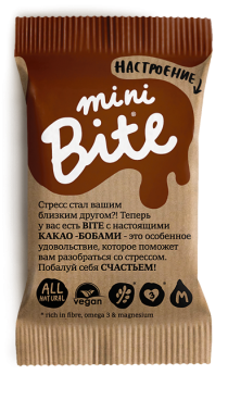
NEW Mini Bite!
Biofoodlab company launch two new tastes: Bite Coconut and Bite Chocolate + new mini Bite’s series. Dsgn by PGS.
NEW Mini Bite!
Biofoodlab company launch two new tastes: Bite Coconut and Bite Chocolate + new mini Bite’s series. Dsgn by PGS.
Suncokret become Granum®
One of the latest Peter Gregson tasks was to re-brand – transform “Suncokret” (Sunflower) into new brand name under 4 different groups – categories: Granum®Food (Seed butters, cold pressed oils), Granum®Drops (Natural oil extracts & supplements), Granum®Bar (Natural Snack bars)
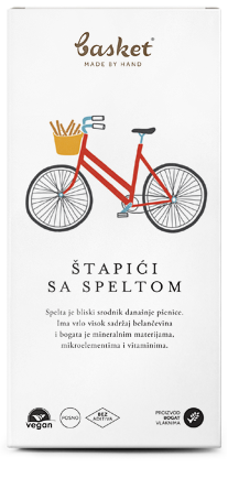
Basket Snacks Redesign
PGS new project task was to redesign packaging and identity for really delicious handmade snack Basket®. Illustration done by: Marijana Rot :)
Basket Snacks Redesign
PGS new project task was to redesign packaging and identity for really delicious handmade snack Basket®. Illustration done by: Marijana Rot :)
POMATO
PGS create new product design for Mistral company. Task was to create the new brand name including complete packaging design concept for canned tomato.
POMATO
PGS create new product design for Mistral company. Task was to create the new brand name including complete packaging design concept for canned tomato.

ФРЭШ – identity & packaging design
Brand ID, illustrations, packaging design, stationary system and home page for ФРЭШ (FRESH) specialized retail store for organic products.
ФРЭШ – identity & packaging design
Brand ID, illustrations, packaging design, stationary system and home page for ФРЭШ (FRESH) specialized retail store for organic products.
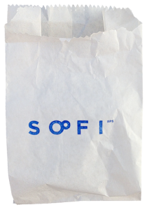
SOFI redesign
Sofi is a workshop that produces cosmetics based on completely natural ingredients.

Bite Space Box 2
In the meantime, we were working on developing aluminum gift box for for Bite.